Grab n Cook is a smart meal-planning and recipe discovery app that helps users turn the ingredients they already have into easy, personalized meals, reducing decision fatigue around cooking.
OVERVIEW
Grab n Cook is a meal-planning and recipe discovery app designed to help users make cooking at home more approachable, flexible, and aligned with their personal preferences. This project was completed as part of a semester-long interaction design course, where my team and I were challenged to design a digital solution that addressed a real-world problem through user-centered design.
Throughout the project, I contributed heavily to user research, interaction design, and prototyping, ensuring that design decisions were grounded in user needs rather than assumptions. The final prototype reflects multiple rounds of iteration informed by usability testing and peer feedback.
PROCESS
User Research & Synthesis
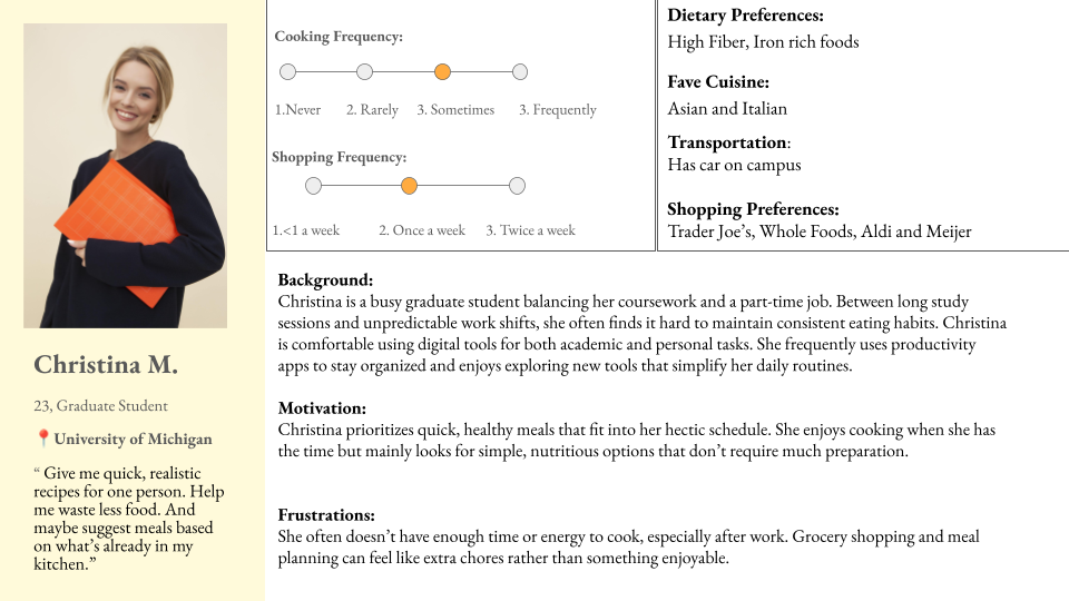
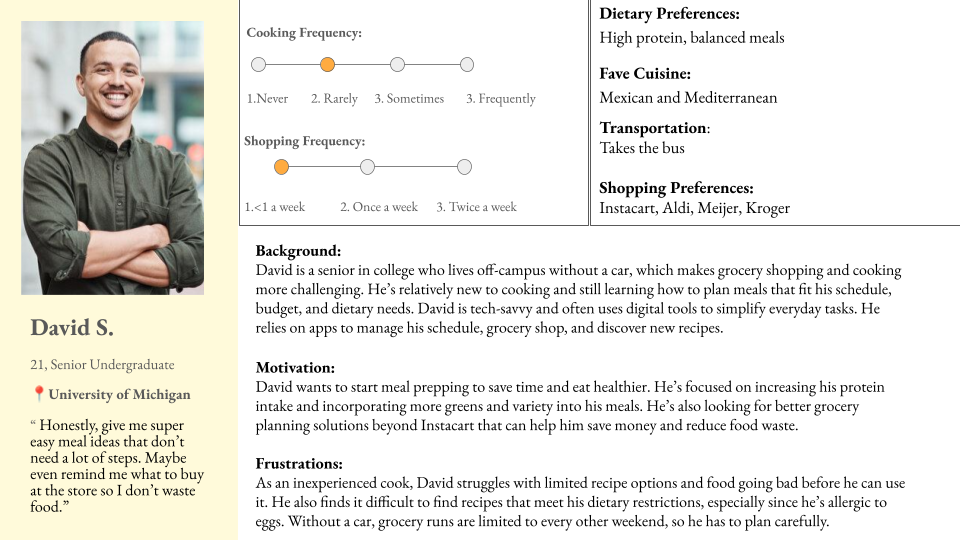
We began by conducting user interviews and surveys to understand how people currently plan meals, grocery shop, and decide what to cook. Common pain points included decision fatigue, lack of personalization, and difficulty accommodating dietary preferences or time constraints.
Research findings were synthesized through affinity mapping and distilled into key themes and representative personas. These personas served as tools to keep design decisions grounded in real user needs throughout the project.
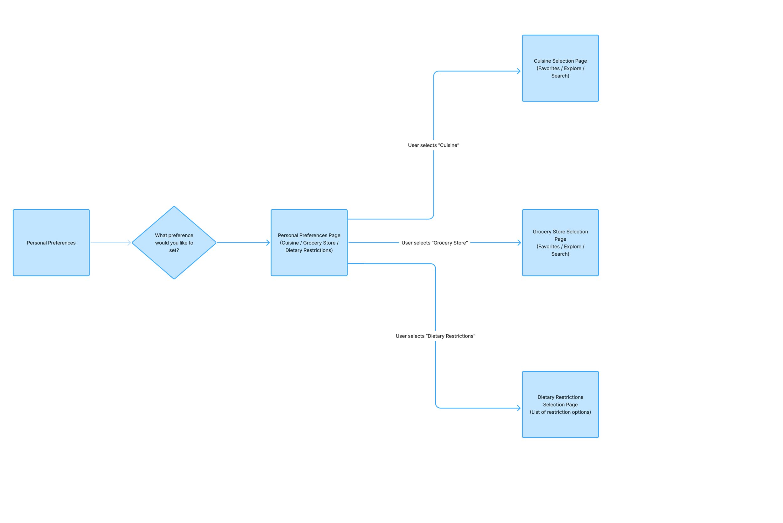
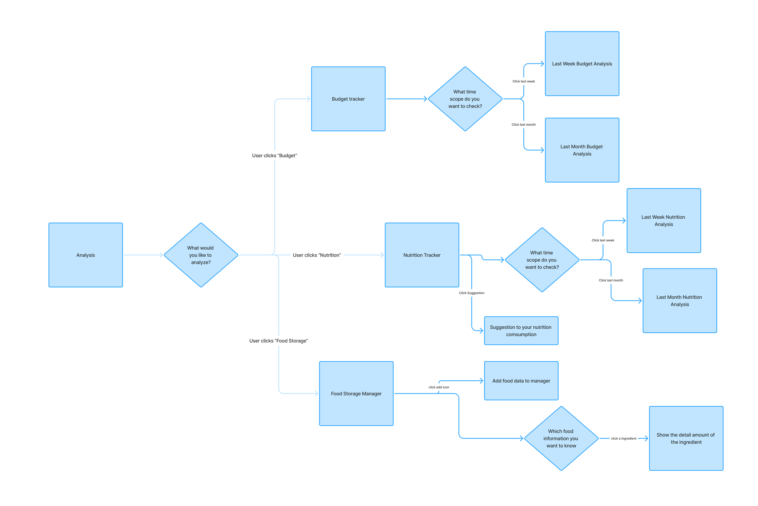
Information Architecture
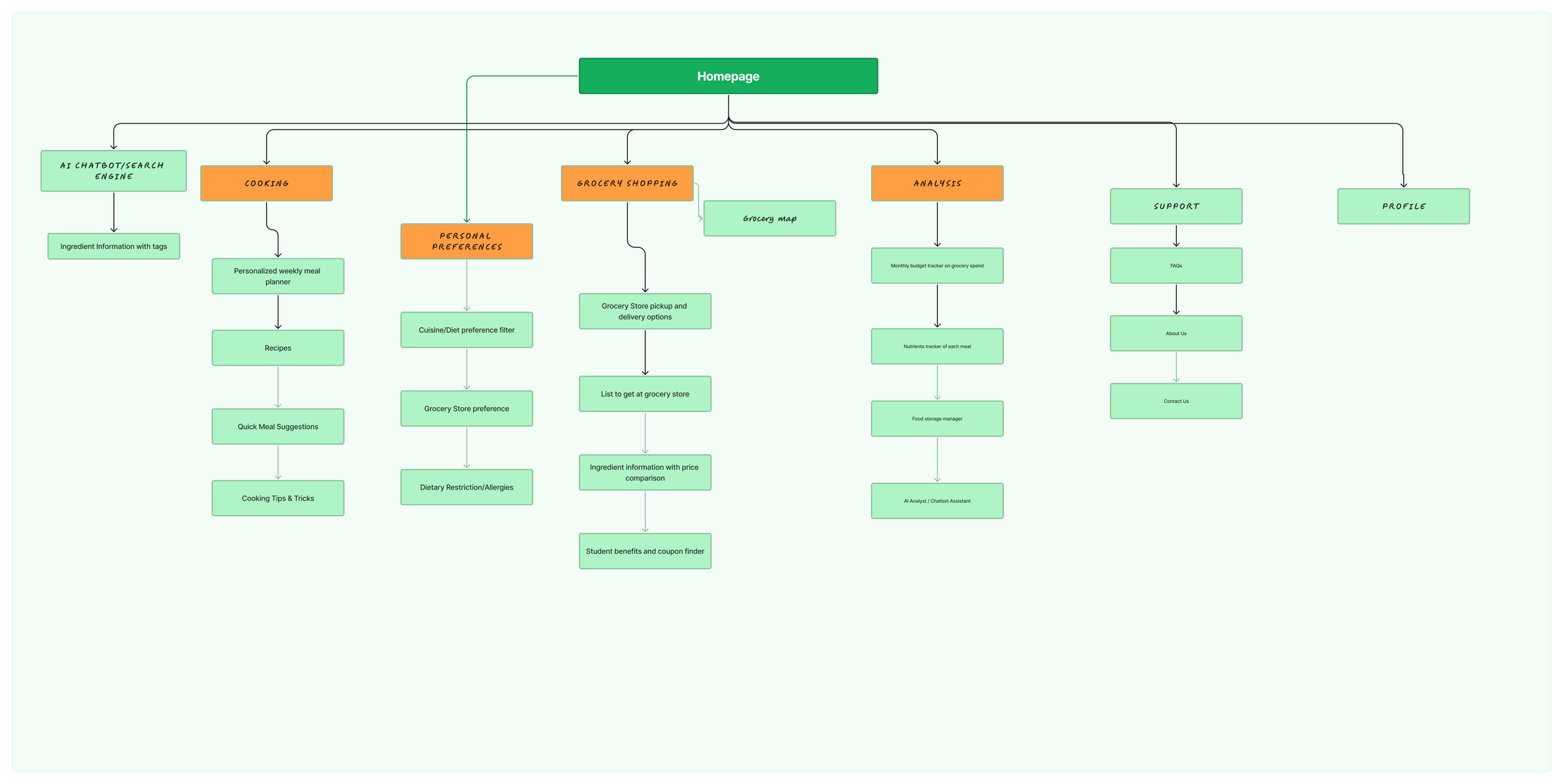
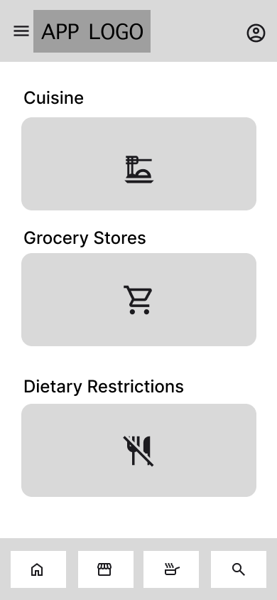
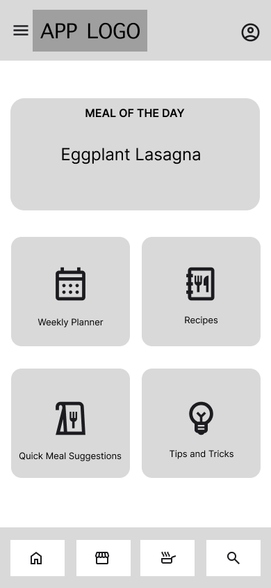
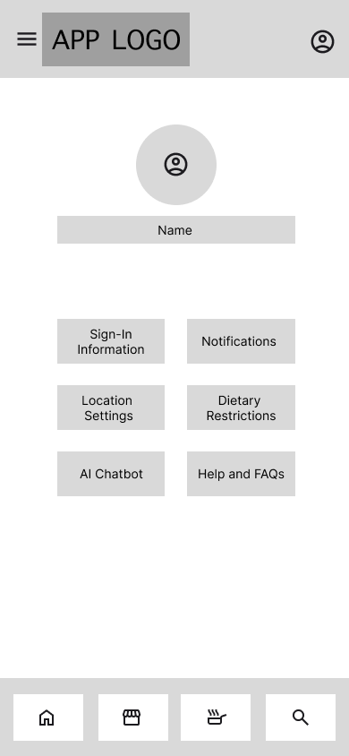
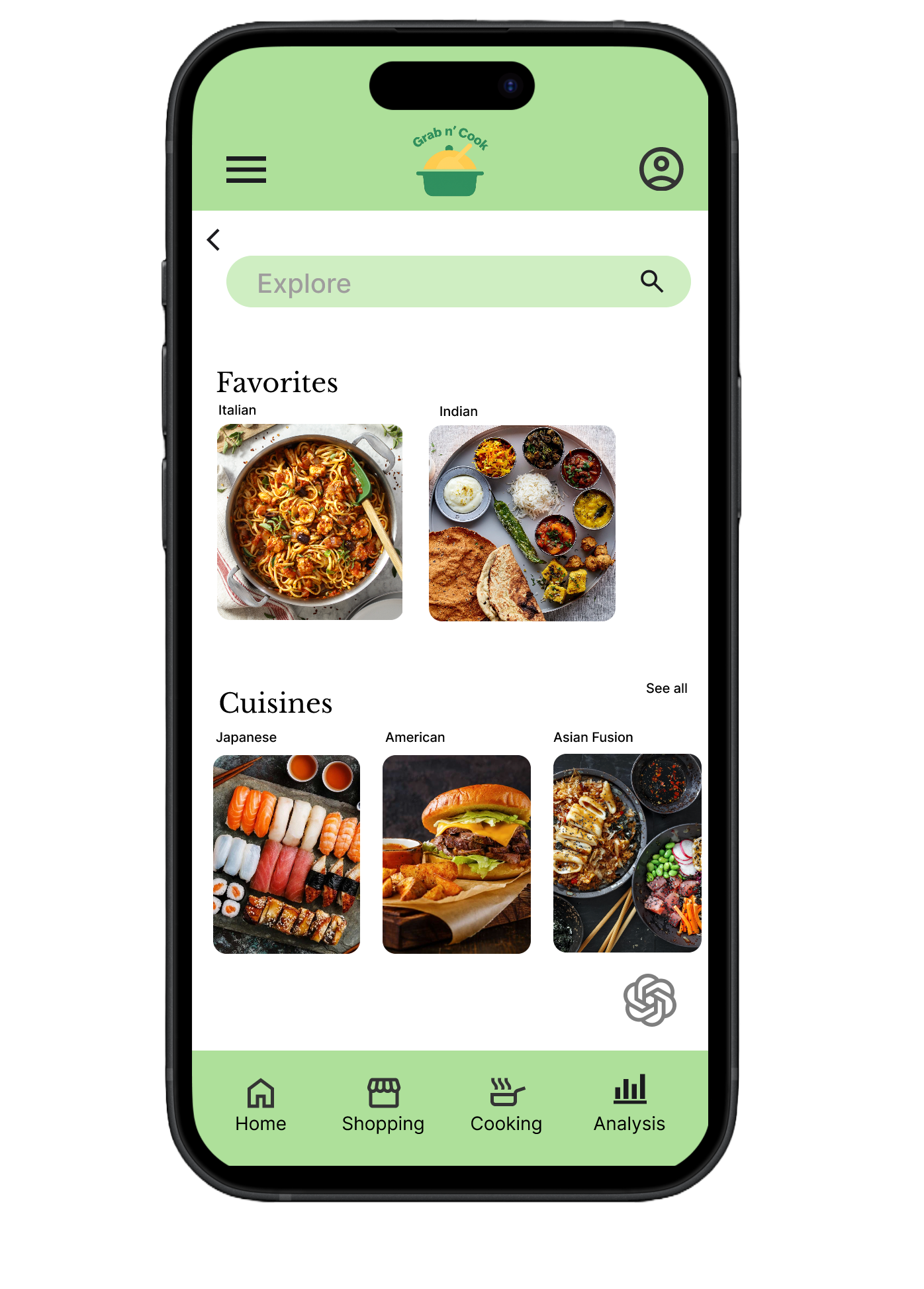
Using research insights, we defined the structure of the app to ensure users could easily navigate between recipe discovery, meal planning, and grocery preparation. The information architecture was designed to prioritize clarity and reduce cognitive load by grouping features based on user goals rather than system functionality. Core tasks such as cooking, grocery shopping, and meal analysis are accessible from the homepage, while personalization and support features remain available without interrupting primary workflows.
User Flows
We mapped key user flows, including onboarding, preference selection, recipe discovery, and meal planning. These flows helped validate navigation logic and identify potential friction points before moving into higher-fidelity designs.
Low-Fidelty Prototyping
User flows were translated into low-fidelity wireframes to explore layout, hierarchy, and navigation without visual distraction. This allowed for quick iteration and early feedback before committing to detailed UI design.
Design Components
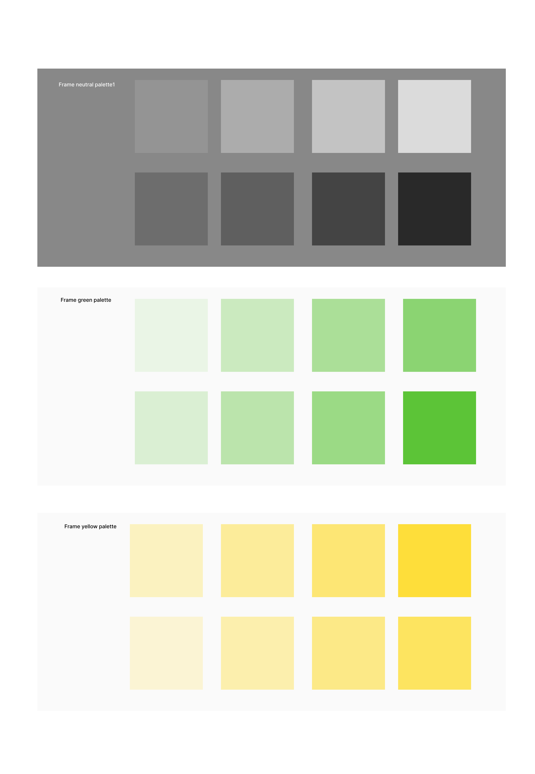
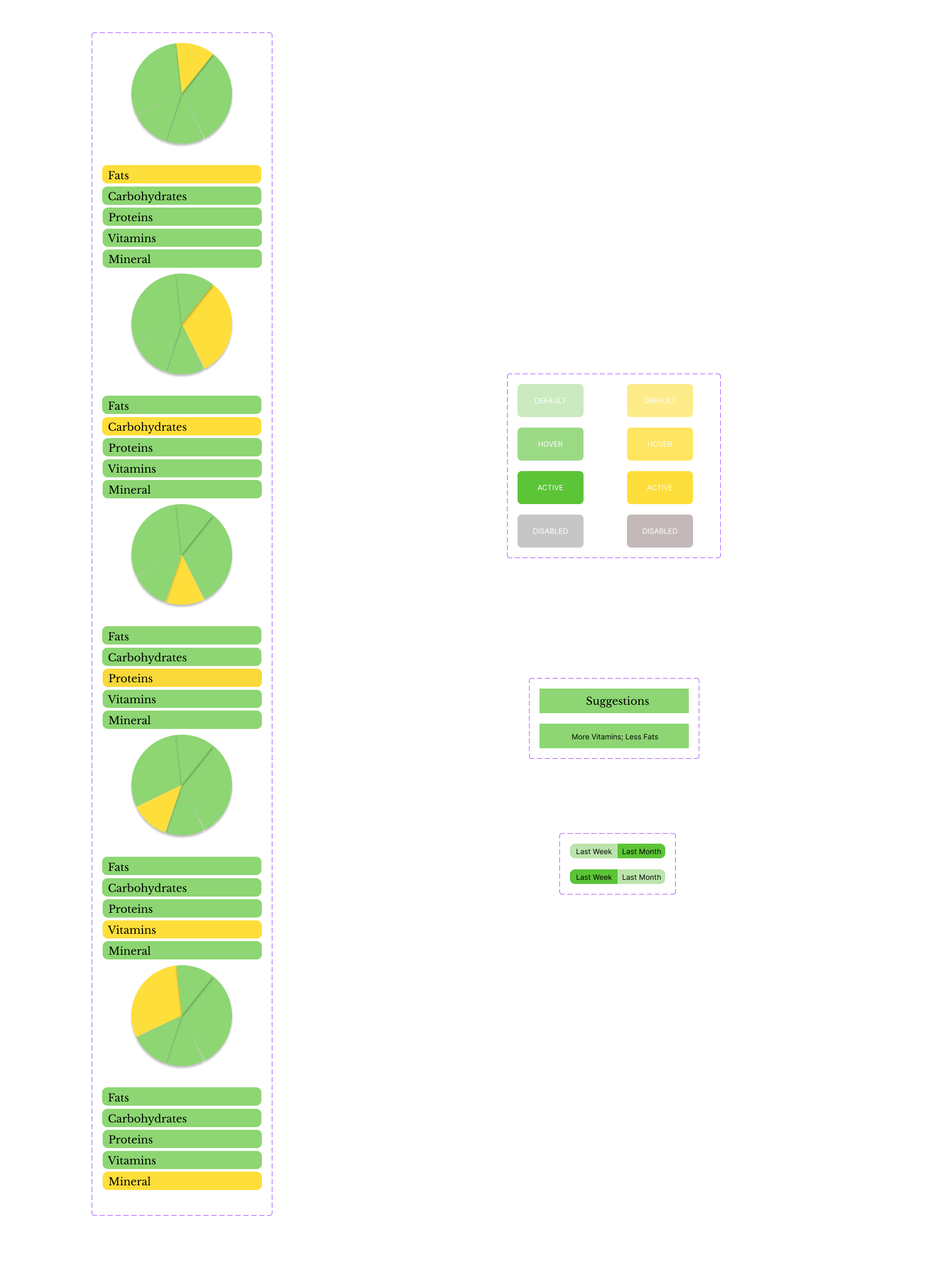
To support consistency and efficient iteration, we developed a foundational design system for Grab n Cook that established clear visual and interaction patterns across the app. This system included defined typography styles, a neutral-first color palette with green and yellow accent variations, and reusable UI components designed to scale across multiple features.
By organizing these elements into a shared component library in Figma, we were able to maintain visual cohesion, reduce redundancy, and iterate quickly as designs evolved from low-fidelity wireframes to high-fidelity prototypes
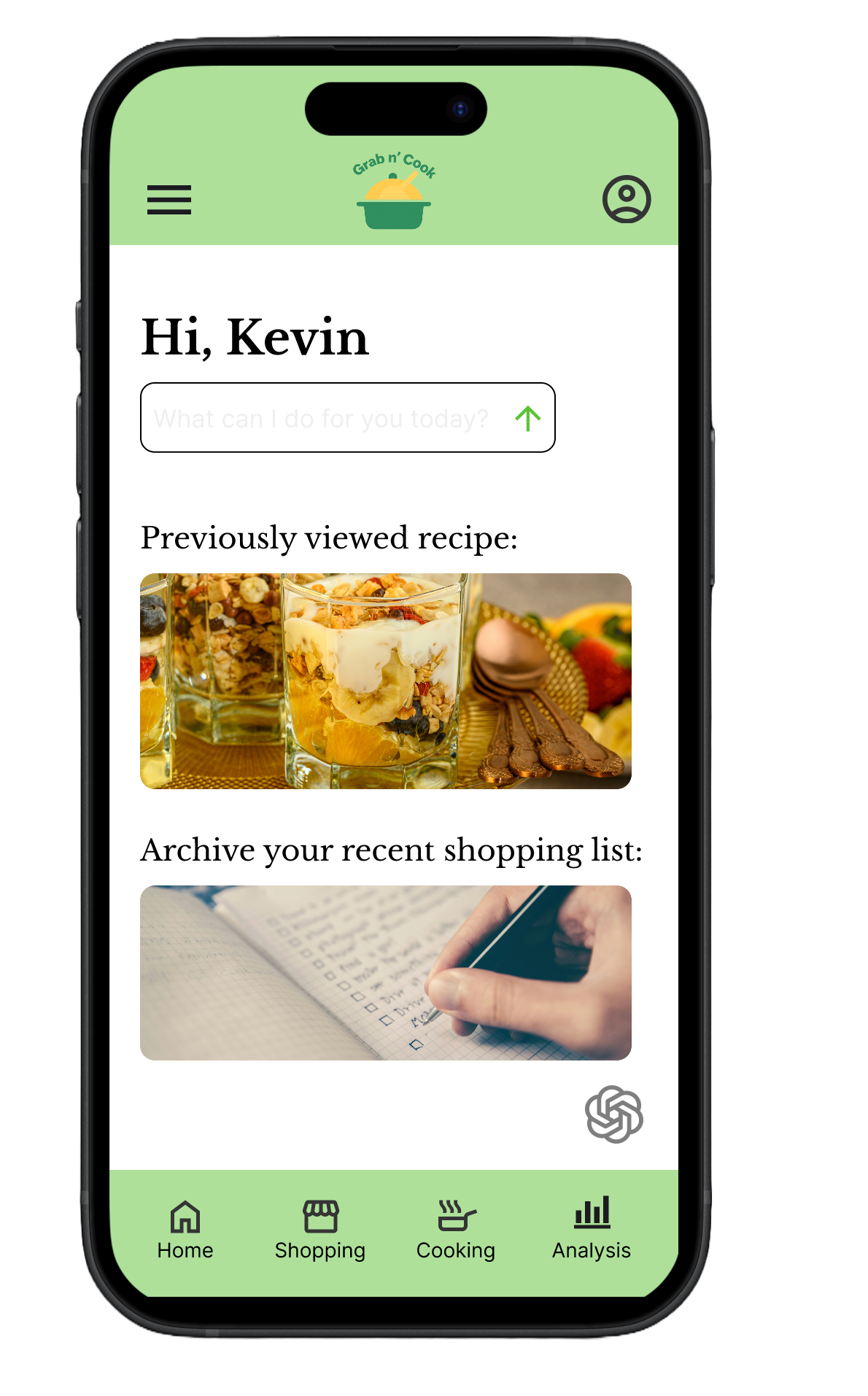
High-Fidelty Design & Iteration
Low-fidelity designs were refined into high-fidelity prototypes with a focus on clarity, accessibility, and visual hierarchy. Feedback from usability testing informed iterative improvements to labeling, navigation, and feature discoverability.
REFLECTION
This project pushed me to think more critically about how design systems, structure, and user flows work together to create intuitive experiences. Grab n Cook strengthened my confidence in designing from research through execution while collaborating within a team and iterating based on feedback.